Adding a text-shadow or glow effect with CSS
Web Design with HTML & CSS
🕑 This lesson will take about 10 minutes
One effect you might like to use is a text-shadow or glow effect using the text-shadow property in CSS.
The text-shadow property has four different attributes separated by spaces:
The first attribute is the horizontal shadow (how much the shadow is to the left or right of the text). A positive number (eg. 3px) will display a shadow to the right of the text and a negative number (eg. -3px) will display a shadow to the left.
The second attribute is the vertical shadow (how much the shadow is above or below the text – this can also be a positive or negative number).
The third attribute is the blur radius (how much blur you want for the shadow).
And the last attribute is the colour for the shadow.
Watch the video below or scroll down to view the sample CSS code.
Here is some sample CSS code applied to a paragraph for a text-shadow with a horizontal shadow of 3px, vertical shadow of 3px, blur radius of 5px and the colour blue for the shadow.
This CSS code will result in a text-shadow that looks like this:

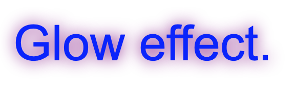
Here is an example using the text-shadow effect with 0px for both horizontal and vertical to shadow to apply a glow effect instead:
This CSS code will result in a glow effect that looks like this:
Next lesson: How to adding padding