Creating a vertical navigation bar (menu) with HTML & CSS
Web Design with HTML & CSS
🕑 This lesson will take about 10 minutes
In this lesson, you will learn how to create a vertical navigation menu with buttons using HTML and CSS code. The menu buttons will change colour when the mouse hovers over them or when a page has been visited.
This lesson also provides you with a CSS layout template that you can use to add a header, content area, and footer in addition to the navigation menu. You can read through the page to see how each section of the code works or jump down the page to see the entire HTML and CSS code.
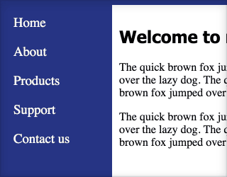
This is what the menu hover effect looks like when the user’s mouse hovers over a button:
Step 1 – Adding the menu links to the HTML code
The first step to creating the navigation is to add the links to the other web pages on your site in the HTML code of the web page. The menu will be inside a div with an ID of “nav”. The links on the menu will then be inside an unordered list – each link will be an individual list item. Here is what the HTML code looks like for the nav div:
<div id="nav">
  <ul>
     <li><a href="index.html">Home</a></li>
     <li><a href="about.html">About</a></li>
     <li><a href="products.html">Products</a></li>
     <li><a href="support.html">Support</a></li>
     <li><a href="contact.html">Contact us</a></li>
  </ul>
</div>
Step 2 – Adding the CSS code for the nav div
From here you need to add the CSS code that will style this menu. The nav div will be the first part that we will add CSS code for. The CSS code for the nav div below includes a dark blue/purple background colour, a height value of 300 pixels and width value of 150 pixels (this could be changed to a % value too). It is also set to float: left; so that the menu is on the left side but this could be left out if you want a horizontal menu. Lastly, 5 px (pixels) of padding is added.
#nav{
 background-color:#334a94;
 height:300px;
 width:150px;
 float:left;
 padding:5px;
}
Step 3 – Adding the CSS code for the unordered list
Then we add the style information for the list <ul> element. The list-style-type property is set to to none so that there are no bullets (dot points) on the list. The width of the unordered list is set to 100% so it takes up all of the width of the div, and the background-color property is set to a dark blue/purple colour here. You could add margin and padding if you want or leave them as 0.
ul {
    list-style-type: none;
    margin: 0;
    padding: 0;
    width: 100%;
    background-color: #334a94;
}
Step 4 – Adding the CSS code for links inside each list item.
Here we add a style that will apply to any link that is a list item on a list. Remember, the <li> tag is used to create list items and the <a> tag is used for links. For this style, we change the font-family to Calibri, font-size to 14pt, and font-style to none. The display property is set to block (change to inline if you want a horizontal menu), the color property for the text is white, some padding is added, and text-decoration is set to none so that the links are not underlined.
li a {
  font-family:Calibri;
  font-size: 14pt;
  font-style:none;
    display: block;
    color: #FFFFFF;
    padding: 8px 0 8px 16px;
    text-decoration: none;
}
Step 5 – Add the CSS code for visited links
By adding the “li a:visited” CSS code, we are applying a style to only links on a list that link to a page that has been visited by the user.
li a:visited {
    background-color: #4CAF50;
    color: #FFFFFF;
}
Step 6 – Adding the CSS code for hover links
We can apply a style to links when the mouse hovers over a link (button). On this menu, we have applied a style that will change the background colour of a button to a light purple colour and the font colour to black whenever the mouse hovers over a button.
li a:hover {
    background-color: #786ED4;
    color: #000000;
}
And that’s it! You can change the code to suit your theme and try making a horizontal menu instead of a vertical menu.
Complete code
Here is the entire HTML and CSS code:
Next lesson: Drop-down menus