Add Controls to a Flet app
GUI app development with Python & Flet
🕑 This lesson will take about 30 minutes
Controls
The user interface (UI) of a Flet app is made of Controls (also known as widgets). For controls to be visible to the user, they must either be added to a Page, or inside other controls. A Page is the top-most control in a UI. Controls can be nested in each other. For example, a Page can contain controls such as a row, and a row can contain controls such as text or buttons.
Controls have different properties that can be modified to customise how the control appears or works. For example, text has properties such as value (the actual text that will be displayed) and color (the colour of the text).
Text
Here is an example of adding a text control to a Flet app’s user interface:
t = ft.Text(value="Hello, world!", color="green")
To display the control on a page, you then need to add it to the Controls list of a Page (using the append method) and call the page.update() function to apply the page changes to a web browser or desktop client. Note: For more information about Controls and example code, visit Flet’s docs on Controls.
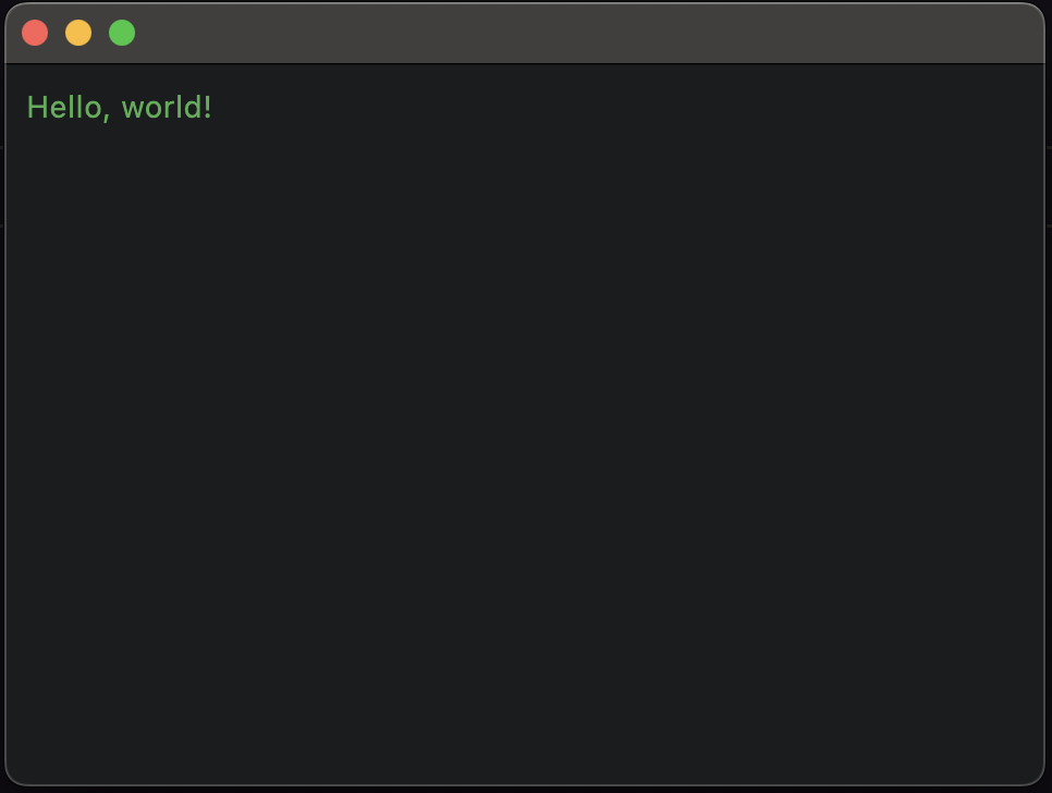
Try out the following code to create a native desktop UI window that contains some green text that says "Hello, world!".
After running this code (eg. using the command python3 app.py ), a new native UI window should open displaying the text "Hello, world!", like example shown in the screenshot below.
Modifying controls
You can modify controls and the changes will be applied in the next call to the page.update() function. Note: There’s also a shortcut for writing page.controls.append(t) and page.update() . Instead of writing these two lines of code, you can just write page.add(t) as shown in the example below. Then, when you want to apply changes to the control, you can call the page.update() function.
In this example, a timer is created and the text control’s value is updated every second to display the current time in seconds. Once the timer, reaches 10 seconds, the message “Time’s up!” is displayed. Note that the text’s font size is also set by specifying a value for the size property. To find out what other text properties you can modify (eg. text colour, background colour, size, font family, style, etc.), visit Flet’s docs on Text.
Run the code above and a window will display with a timer counting up, as shown in the example below.
Some controls (like Page) are "container" controls which means they could contain other controls. For example, the Row control allows you to add other controls in a row one-by-one, for example:
The code above adds a Row control which can be a container for other controls such as Text, as shown in the screenshot below.

The page.update() function only sends the changes made since its last call. This means that, for example, you can add a couple of new controls to the page, remove some of them, change other controls' properties and then call the page.update() function to do a batched update, for example:
The code above will add lines of text to the window but will continuously delete “old” lines if there are more than 5 lines so that only the newer lines are shown.

Buttons
The example code below shows how to create a function that is called when a button is clicked. The function will simply display some text on the screen.
And here is a screenshot showing the result of this code after clicking the button:

Checkbox and TextField
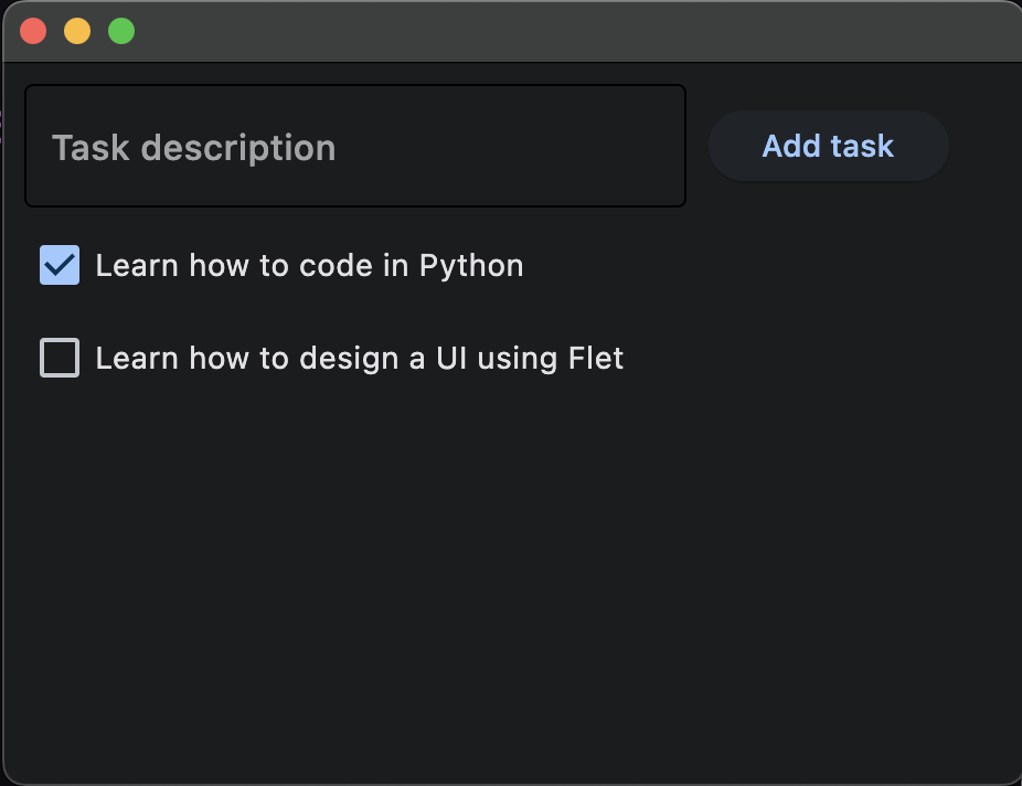
And here is a more advanced example of using a button for a simple to-do list app. It also has a TextField control to get text input from the user (eg. a task description) and adds a Checkbox control next to each task in the list so a user can mark a task as complete or incomplete. Note that the function new_task.focus() is called so that the Textbox is in focus and the user can continue typing straight into the Textfield after adding a task without having to click and select the Textfield again.
And here is the result…
Challenges
Modify the code above so that the program has a Python list containing existing tasks and automatically adds the existing tasks in the Python list to the UI’s to-do list when the app loads.
Take this further by using a dictionary that contains different existing tasks. Each task has a description and a completion status (eg. complete or incomplete). Make the app automatically add the tasks to the UI to-do list when the app loads and automatically mark the tasks as complete (fill the checkbox with a tick) if they have been completed.
The visible property
Every control has the visible property that is True by default. When this property is set to True, the control is visible and when it is set to False, the control is invisible. Setting the visible property to False completely stops the control (and all its children, if there are any) from rendering on the page. Hidden controls cannot be selected with a keyboard or mouse and cannot emit events.
Using the example code below, the Text control will not be visible on the page.
t = ft.Text(value="Hello, world!", visible = False)
The disabled property
Controls also have a disabled property which is False by default. The disabled property is mostly used with data entry controls like TextField, Dropdown, and Checkbox. However, a parent control could be disabled and all of its children controls will also be disabled.
For example, if you have a form that has multiple TextField controls, you can set the disabled property for each of them individually. In the example code below, two TextField controls are added to a page (so the user can enter their first and last name). The second TextField control is set to disabled = True.
And here is what the screen would look like:

Referencing controls
Flet controls are objects. So we can access their properties, we need to keep references to those objects (in the form of variables). Take the following code, for example. This code adds two TextField controls so the user can enter their first and last name. These control objects can be referenced through the variable names first_name and last_name. In this example, a greeting (containing the user’s first and last name) is displayed to the user after they click the button (using a Text control).
The code above would display the following UI window.

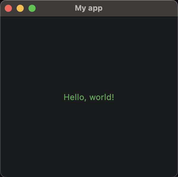
Setting window title, width and height and centering content
The following example code shows how to set the title, width and height of a window as well as how to align content to the center of the window (both horizontally and vertically).
The code above would produce this result:
In the next lesson, we will look at some more examples of getting user input, including the Dropdown control.
Next lesson: Getting user input